Your first recipe for a bold, flavorful brand.
Join other nutritionists, wellness coaches, chefs, and food brands already cooking up success with Kakao Studio.
Your first recipe for a bold, flavorful brand.
Join other nutritionists, wellness coaches, chefs, and food brands already cooking up success with Kakao Studio.
Like curiosity itself, Kid Food Explorers began as a spark, a question: What if food could be a playground for discovery?
When Arielle “Dani” Lebovitz first shared her vision, it wasn’t about selling books. It was about changing how children experience food, with curiosity, joy, and confidence. Her conviction was contagious. From the very beginning, I felt this was the kind of work that mattered, a creative journey where design could truly produce a positive impact in the lives of many.
The metaphor guiding everything was simple but powerful: curiosity as the key to food exploration. Through color, character, and storytelling, the brand would turn the everyday act of eating into an adventure for the body and the mind.
Client: Kid Food Explorers, a child-focused educational brand founded by pediatric dietitian and author Arielle “Dani” Lebovitz, MS, RDN, CSSD, CDE. Her mission: to help families and educators empower kids to build a positive relationship with food through fun, curiosity, and STEAM-based learning.
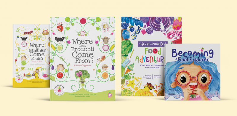
Business Context: Before Kid Food Explorers, Arielle’s platform was known as Experience Delicious, a personal brand that had grown organically but needed to resonate more with parents and increase cohesion across books, social media, and educational resources. The transition to Kid Food Explorers required a complete rebrand, not just a new logo, but an entirely new visual ecosystem that could unify her expanding catalog of children’s books, printable activities, website, and professional B2B collaborations.
Goals:
Challenges & Opportunities:
The guiding principle was “adventures in food.” We approached the brand as an invitation, not instruction. Every visual element needed to spark exploration and joy.
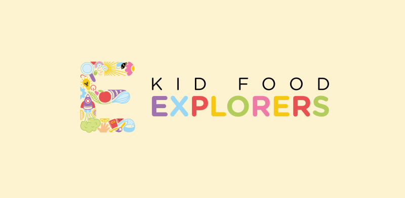
The logo, a vibrant “E” (for exploration, explorer) composed of illustrated icons, became the brand’s heart. Each symbol represents a facet of exploration: a magnifying glass for curiosity, a rocket for imagination, a leaf for growth, and an apple for nourishment. Together, they form a visual metaphor for the brand’s mission: learning through curiosity and discovery.
We developed a flexible iconography system, color palette, and illustration style to unify every touchpoint, from books to printables to web graphics. The palette is bright and joyful, celebrating food as a shared experience. Typography features soft, rounded edges for approachability, paired with professional layouts to retain credibility.
While children are the emotional focus, parents and educators are the decision-makers. Our visual tone bridges both:
Logo & Brand Identity:
A playful, inclusive mark representing discovery and diversity, adaptable for all age groups and contexts.
Iconography System:
A library of illustrated icons symbolizing exploration, science, and play, forming the visual DNA for web and print.
![]()
Character Universe:
A set of illustrated explorers (and their dog) embodying curiosity and teamwork, designed to make learning feel like a story.

Editorial Design & Illustration:
Digital & Web Assets:
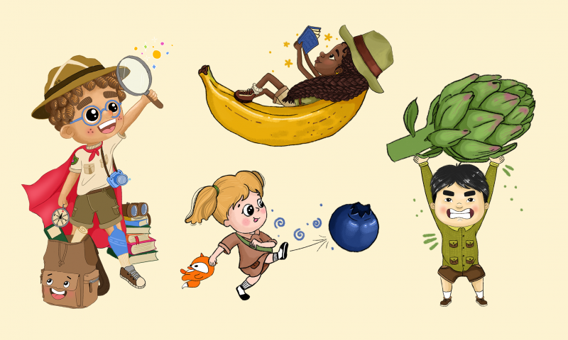
A defining component of the brand’s storytelling became the Food Explorer characters, four illustrated children and their loyal dog companion, each representing a unique aspect of curiosity and learning:
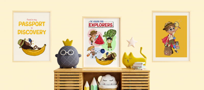
These explorers, alongside their expressive backpack “Adventure Pack,” embody the diverse ways children approach food discovery. Through books, posters, and activities, they’ve become narrative anchors that guide kids through food adventures, turning abstract nutritional education into relatable stories.

The “Anatomy of a Food Explorer” poster reinforces these qualities, introducing each character’s tools (like the “YumZoomer” magnifying glass or the “Explorer Hat”) as metaphors for exploration and growth. This character system transforms eating from a rule-based act into an identity of curiosity and empowerment, helping reshape how children see themselves in relation to food, not as picky eaters, but as explorers.
Audience & Community Growth:
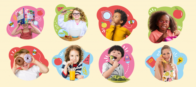
Since the rebrand, Kid Food Explorers has cultivated a vibrant, loyal community on social media. On Instagram, the brand’s audience has grown steadily into an engaged network of parents, educators, and fellow nutrition professionals who actively participate in challenges, activities, and discussions around curiosity and food exploration.
Collaborations & Industry Recognition:
The brand’s solid identity and approachable tone have opened doors to collaborations with major industry players such as USA Pears, The Dairy Alliance, Superfresh Foods, and GoGo SqueeZ, among others. These partnerships highlight the brand’s credibility and its capacity to bridge professional expertise with fun, family-centered education.
Professional Alliances:
Beyond corporate collaborations, the project has fostered strategic partnerships with other nutritionists, educators, and children’s wellness brands, amplifying the mission and reach of Kid Food Explorers across multiple audiences.
Social Proof & Feedback:
On Amazon, the books consistently receive 4.9/5-star ratings across dozens of reviews. Parents emphasize how approachable and engaging the visuals make the learning experience:
“We bought this book to give more exposure to our selective eaters, they love reading about what vegetables do in your body!”
“Colorful and playful … teaches fun facts from farm to table.”
Emotional & Brand Impact:
Future Potential:
With a strong identity and expanding collaborations, Kid Food Explorers continues to inspire families worldwide to approach food with curiosity, confidence, and joy.
This project reaffirmed the power of purpose-driven design, how visuals can educate, empower, and connect. Collaborating with Arielle demonstrated that when design meets mission, creativity becomes a force for real-world change.